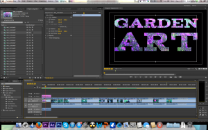
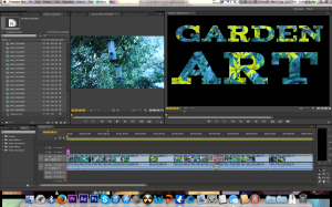
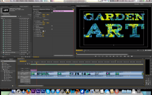
But after trying that i felt that the text wasn't as crisp as i would have liked so i decided to chroma key the text out and place the text on the layer on top of the video. (i created the text in photoshop to make colour keying easier).
Below are 3 different logos i tried.
The next thing i did was to colour correct the video using RGB curves. i like to colour correct using RGB curves as i feel i have more control over the colours. This meant i could make the sky bluer and the trees greener making them stand out more and look more clear as can be seen in the pictures below.
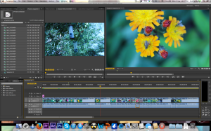
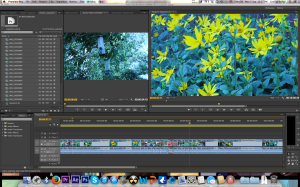
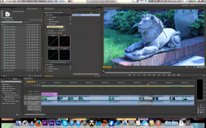
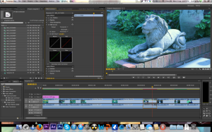
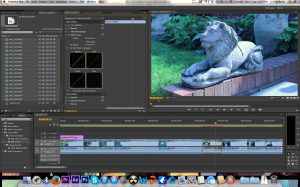
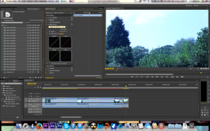
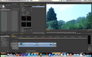
After completing the colour correction i then re watched the video changing a few minor parts and then exported and uploaded the video which you can see in a previous post.
No comments:
Post a Comment